Ippocra Brand
A reference for anyone creating content, visuals, or communications for Ippocra.
Use this page as your guide when writing blog posts, producing videos, designing social media content, or building anything that represents Ippocra to the world. Consistency builds trust.
Logo
The Ippocra logo combines the wordmark with the Ippo — our hippopotamus mascot. Always use the provided assets; never recreate or alter the logo. Choose the variant that provides the highest contrast against its background.

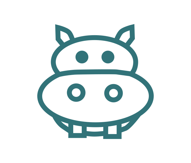
Ippo Outline
Use on white or light backgrounds

Green Ippo on White
Primary logo — light backgrounds

White Ippo on Green
Use on brand-colored backgrounds
Full Logo — Green Background
Preferred for social media and documents

Rectangular — Green
Banners, headers, wide-format uses
Rectangular — White
Banners on light backgrounds
Do not stretch, recolor, rotate, or add effects to the logo. Do not place it on backgrounds that reduce legibility.
Color Palette
Ippocra's palette is built around a teal primary that conveys calm, health, and trust. The accent blue adds energy for calls to action.
Primary
#3b9ba8
CTAs, links, brand accents, buttons
Primary Dark
#2e7d88
Hover states, deeper contrast
Primary Light
#66bec9
Subtle backgrounds, highlights
Accent
#406EBA
Secondary CTAs, feature highlights
Dark Text
#0f172a
Headings, primary text
Muted
#475569
Body text, secondary UI elements
Background
#f8f9fa
Page background, section fills
White
#ffffff
Cards, contrast surfaces, text on dark
Typography
Typography uses the system font stack. Hierarchy is established through size and weight, not decorative fonts. Use the CSS classes below consistently across all pages.
.page-title — 800 weight, xxx-large
Page Title
.section-title — 600 weight, xx-large
Section Title
.section-header — 600 weight, larger
Section Header
.paragraph-lg — larger size, muted color
Larger paragraph text — used for subtitles, introductory sentences, and important callouts.
.paragraph-md — medium size, muted color
Standard body text — used for descriptions, feature explanations, and general content. Readable at all screen sizes.
.paragraph-lg.paragraph-bold — semibold modifier
"Less complexity. More control. More trust."
The Ippo
The Ippo is Ippocra's hippopotamus mascot — calm, sturdy, trustworthy, and a little bit playful. Different variants represent different user types and plans. Use these characters to humanise content and make the brand approachable.
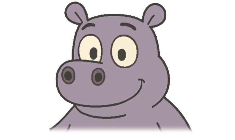
Solo
Individual user
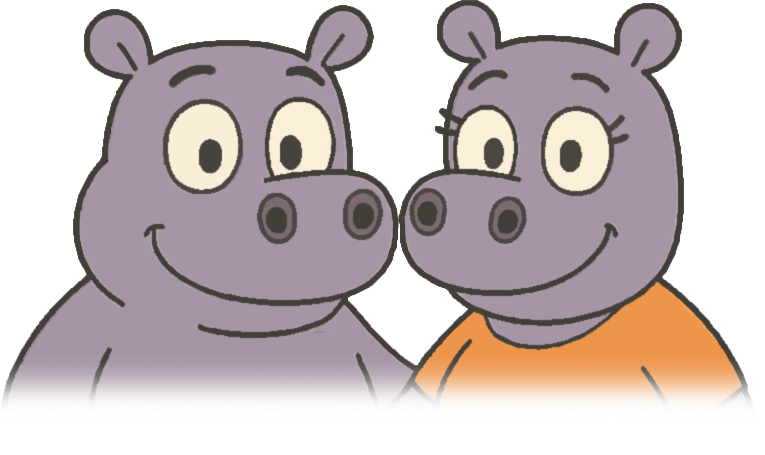
Just Us
Couple / two profiles
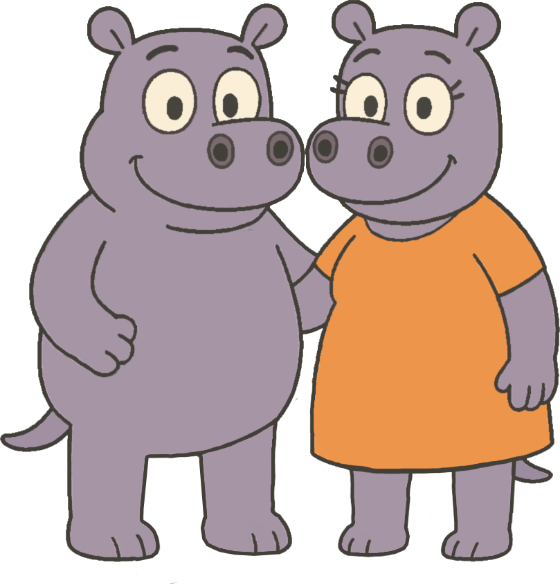
Just Us (full)
Couple, full body
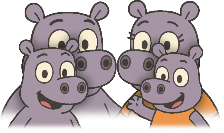
Family
Family plan
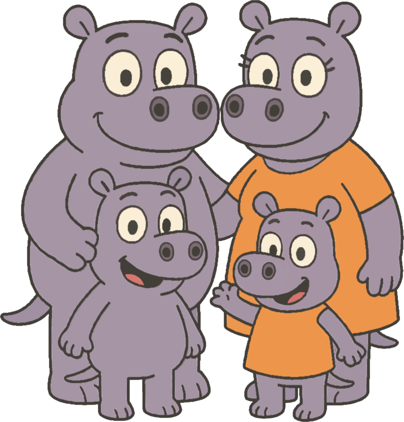
Family (full)
Family, full body

IppoDoc
Doctor / Studio plan
Photography Style
Ippocra's visual language is rooted in the Ancona coast and the Italian landscape — natural light, open horizons, and a sense of quiet clarity. Prefer photos that feel calm, real, and human over stock-photo perfection.

Coastal sunset
Warm, natural light
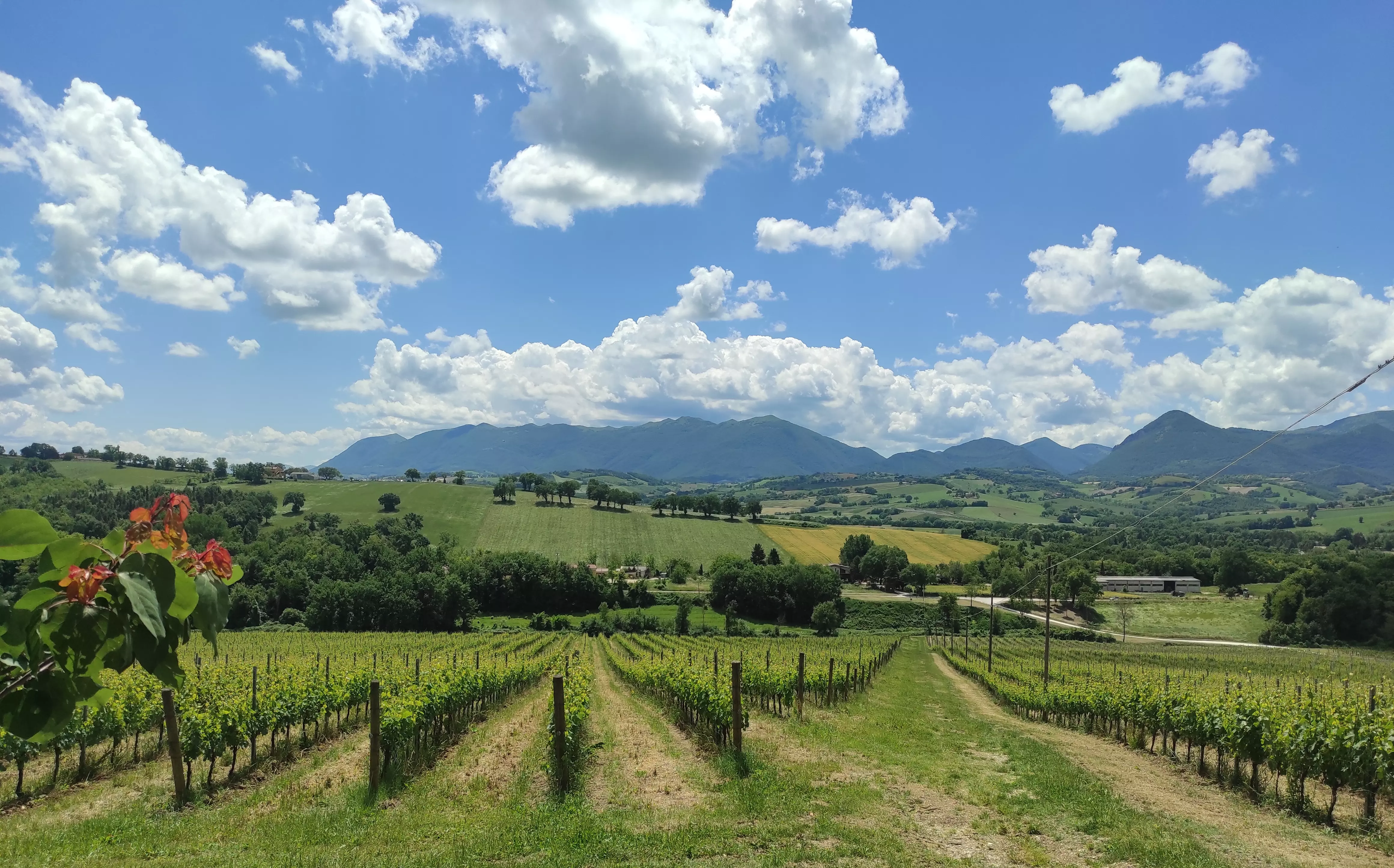
Italian landscape
Grounded, serene
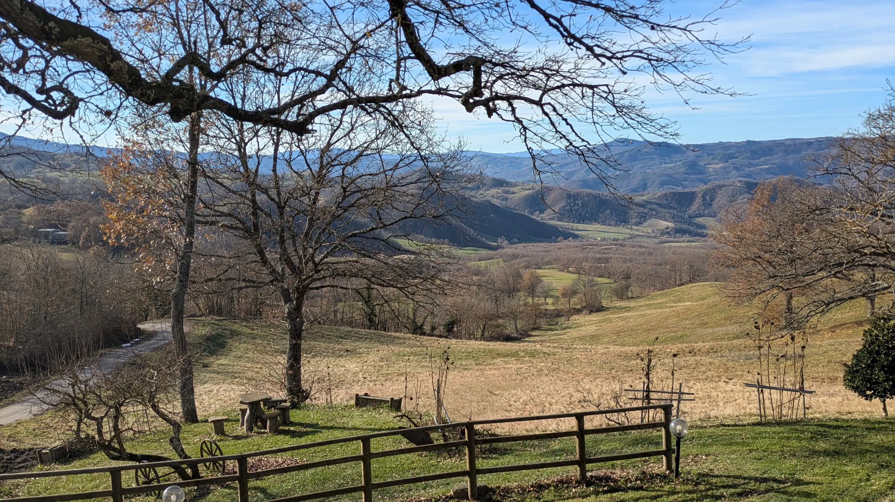
Open horizons
Space and clarity

Seasonal variety
Authentic, not tropical
Do use
Natural light, local landscapes, real places, honest moments
Avoid
Generic stock photos, overly posed images, tropical or foreign settings
Tone
Calm, open, grounded — like the Adriatic on a clear morning
Voice & Tone
Ippocra speaks like a knowledgeable friend, not a corporation. We are direct, warm, and always on the user's side.
We are
- ✓ Clear — we say what we mean without jargon or euphemism
- ✓ Human — we write for real people with real problems
- ✓ Reassuring — health is sensitive; we project calm and competence
- ✓ Respectful of privacy — we treat it as a value, not a checkbox
- ✓ Concise — one idea per sentence, short paragraphs
We are not
- ✗ Hype-driven — no "revolutionary", "disruptive", or "game-changing"
- ✗ Technical for its own sake — encryption matters; FIPS-140-2 jargon does not
- ✗ Paternalistic — we help, not lecture
- ✗ Fear-based — we don't scare users into signing up
- ✗ Corporate — no passive voice, no "please be advised"
Examples
Instead of
"Leverage our state-of-the-art platform to optimise your healthcare data management workflow."
Say this
"Upload your documents once. Find anything in seconds. Share securely when it matters."
Instead of
"Your health data is encrypted with military-grade AES-256 encryption protocols."
Say this
"Your documents are encrypted end to end. Only you can open them."